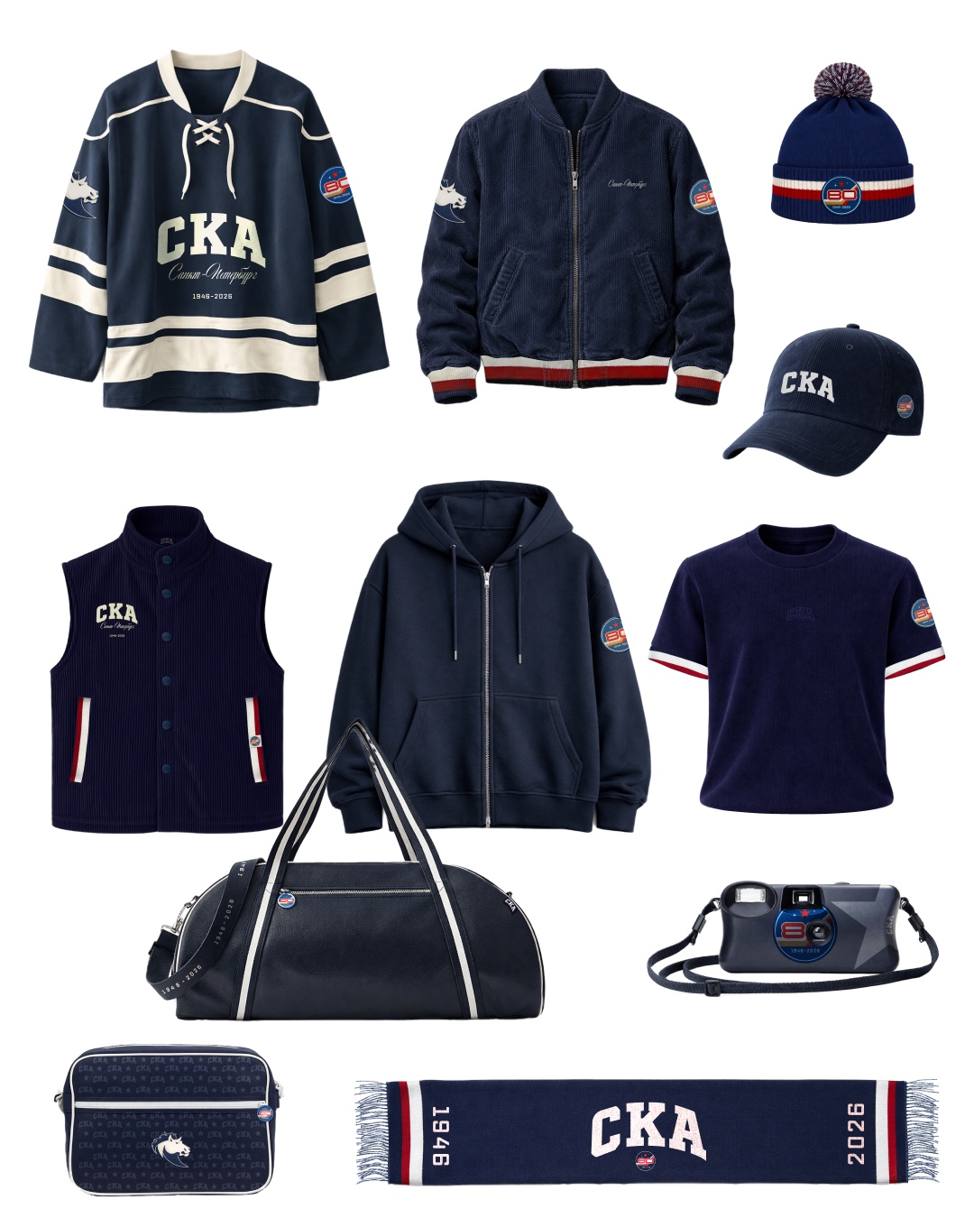
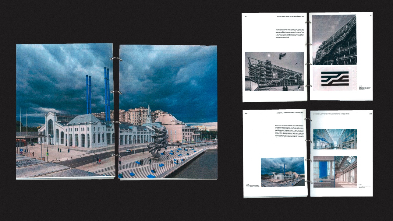
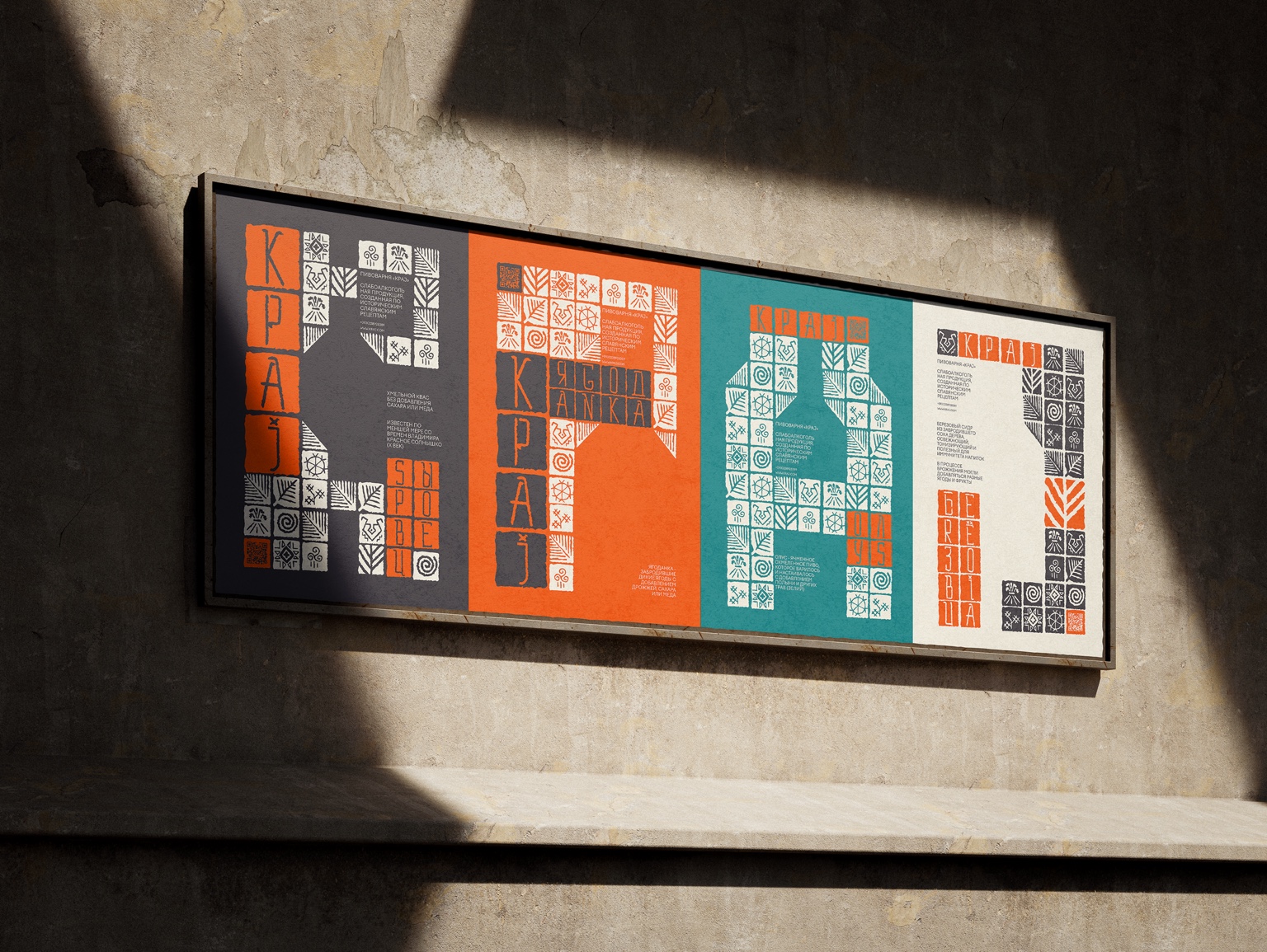
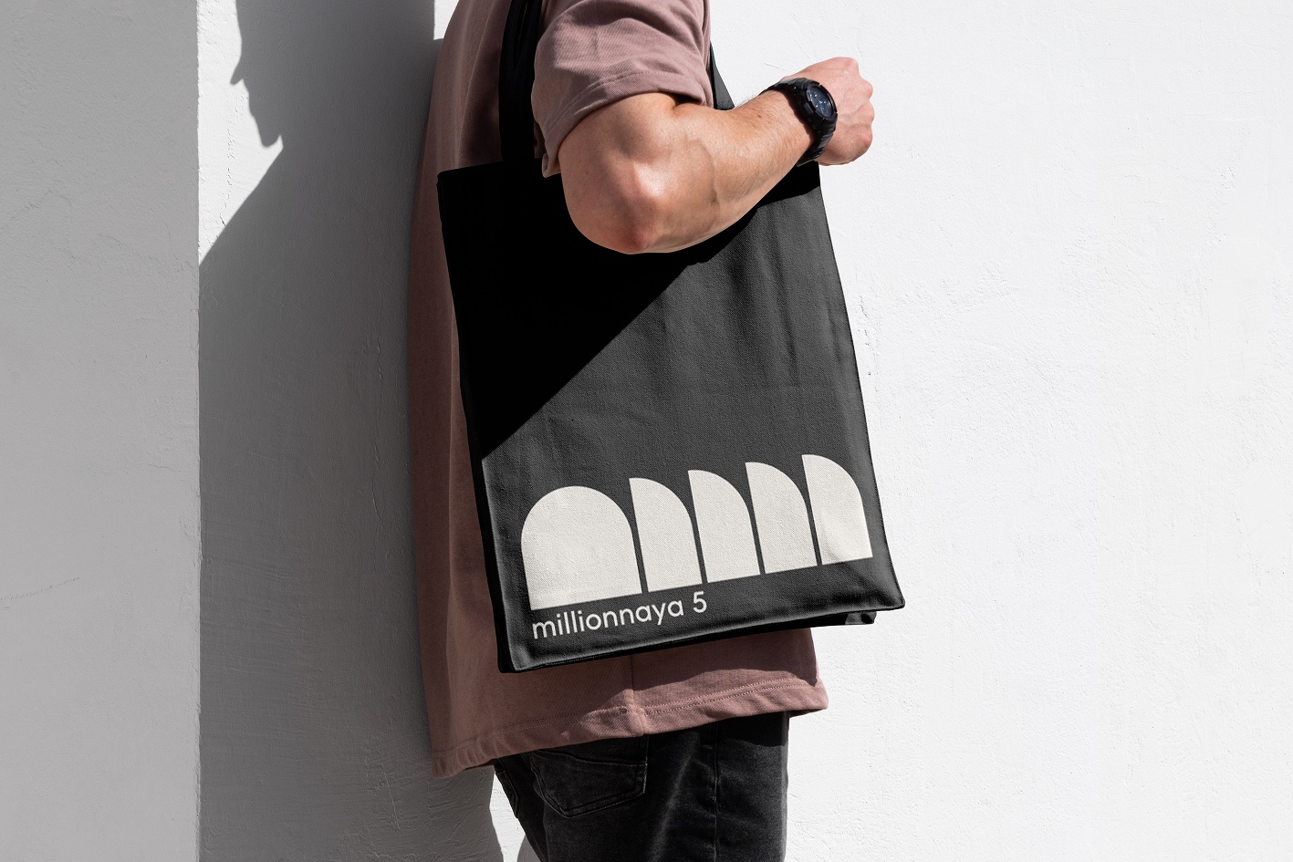
Selected work in merchandise, editorial design and identity.
1 / 4
Merchandise for SKA Hockey Club, Saint PetersburgResearch book: architecture in graphic designPosters for a beer brandIdentity for an art space
Case 01 · 2026
X.Global — Website Redesign
UX/UI Design · Product Thinking · Web Design
01. About the project
Redesign of the multi-page X.Global online-school website that I originally built on Tilda two years earlier. The task was to rethink the user experience while preserving the school’s visual identity and developing a modern, responsive interface.
The goal: an easy, quick path to a trial lesson and fast access to the information people need to make a decision.
My role: UX/UI Designer, Product Designer, art direction, interface design and development with AI.
1 / 1
After · the new X.Global home page
02. The problem
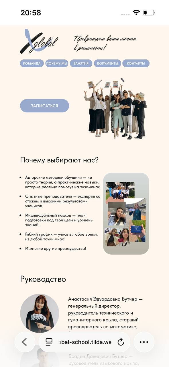
The original website primarily provided information. Visitors had to find details about teachers, learning formats, outcomes and registration by themselves.
Core UX problem: no clear journey from discovering the school to booking a trial lesson.
UI problem: weak responsiveness and inconsistent interface patterns.
1 / 1
Before · the original home page
03. The goal
Discover → Choose a direction → Build trust → Try a lesson
Reduce the steps required to submit an enquiry, make the school’s offer easier to understand and create a comfortable mobile experience.
04. Key decisions
Information architecture
Preserved the multi-page structure and redesigned the hierarchy of information.
Product thinking
Four entry scenarios: exam preparation, improving school performance, university subjects and languages.
Conversion UX
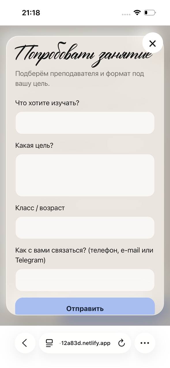
A floating CTA available on every page and a short booking form in a modal window.
1 / 1
A short form for a trial lesson
Trust design
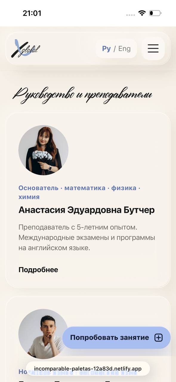
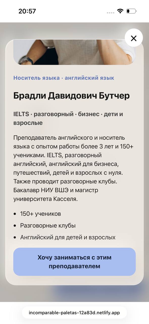
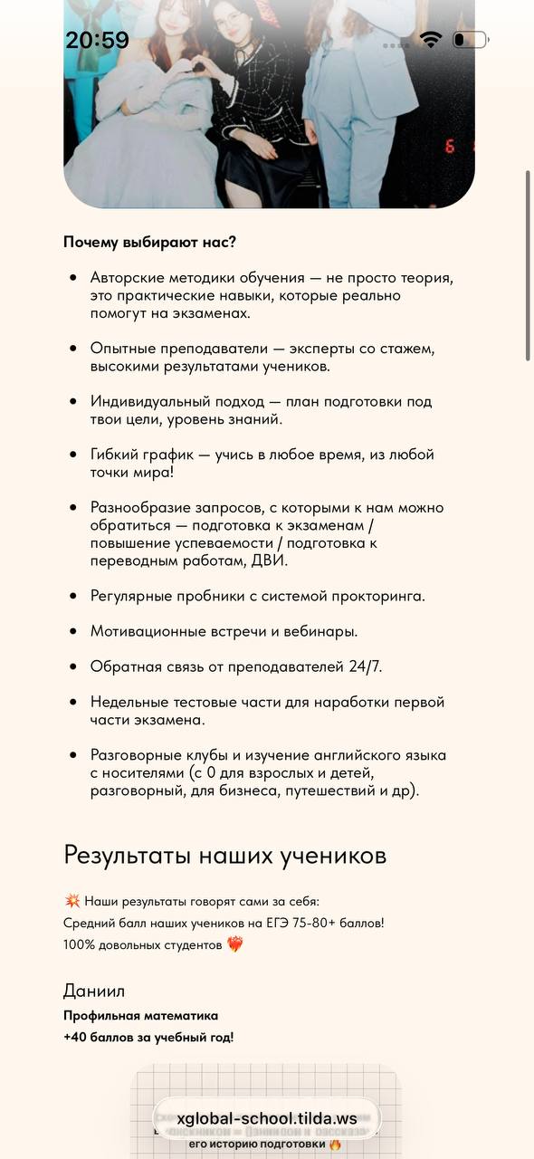
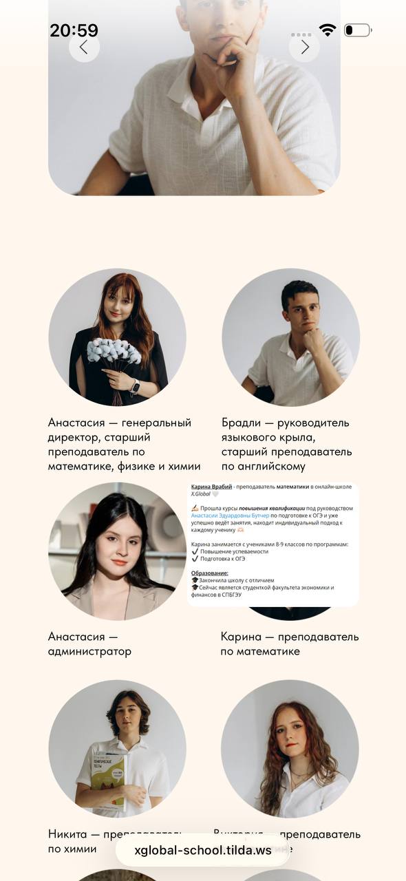
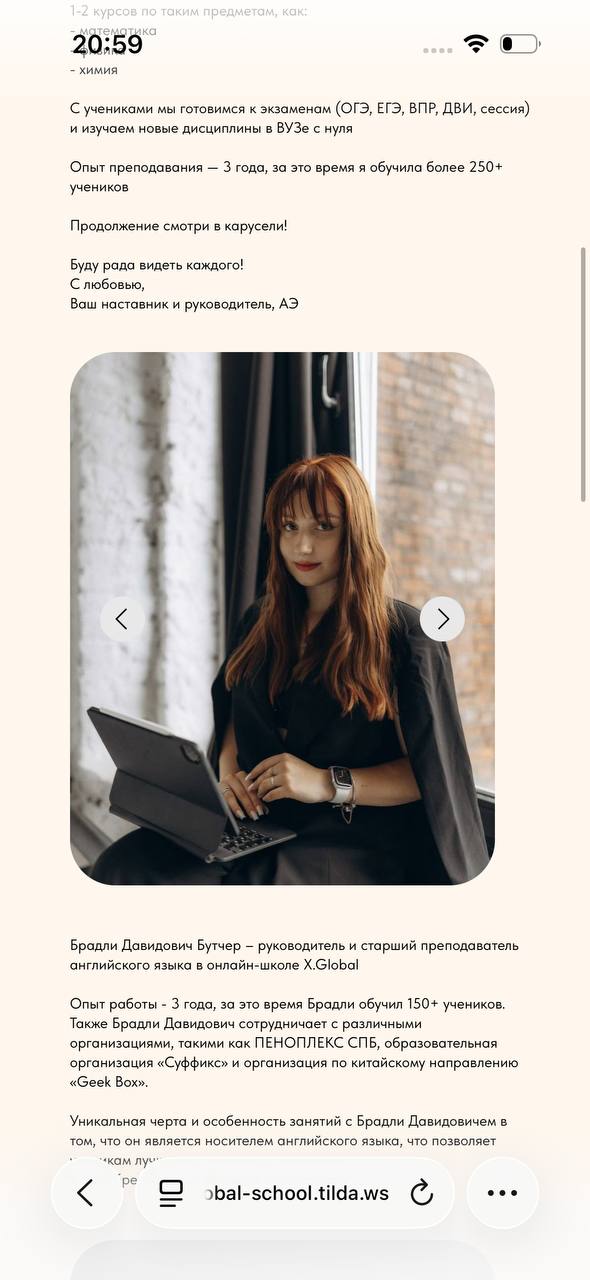
Teacher profiles, student results, real reviews, case studies and school documents.
UI system
Retained the brand palette and handwritten typography; developed a card system with soft neumorphism.
Responsive design
Responsive grids, mobile navigation, horizontal galleries and touch interactions.
Localization
Russian and English versions of the interface.
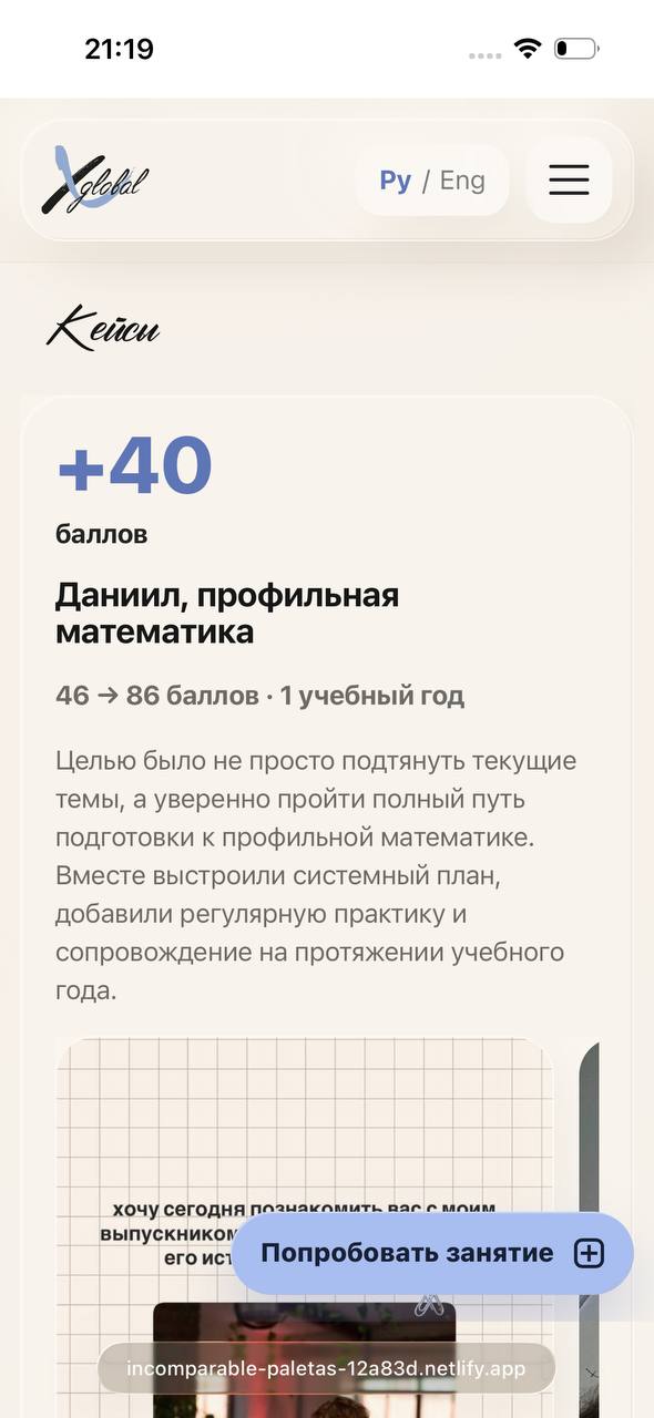
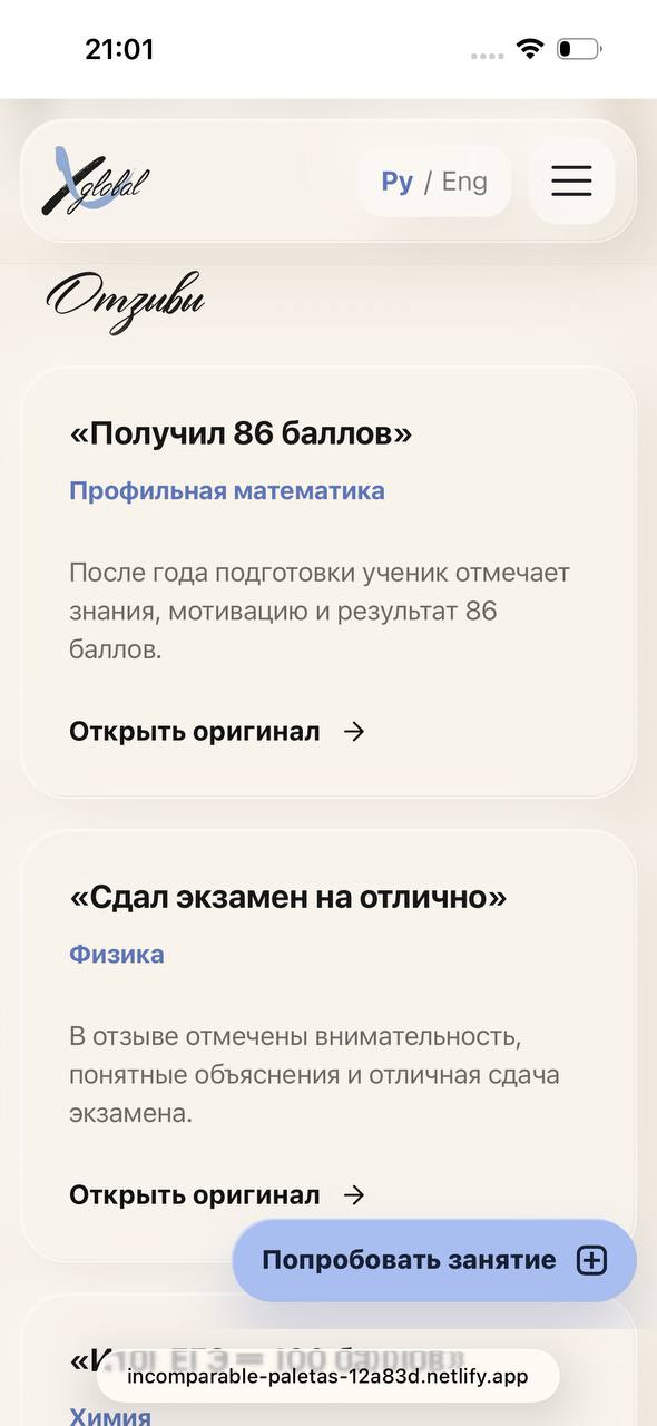
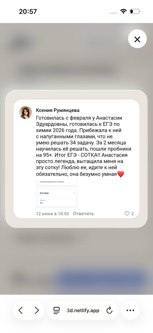
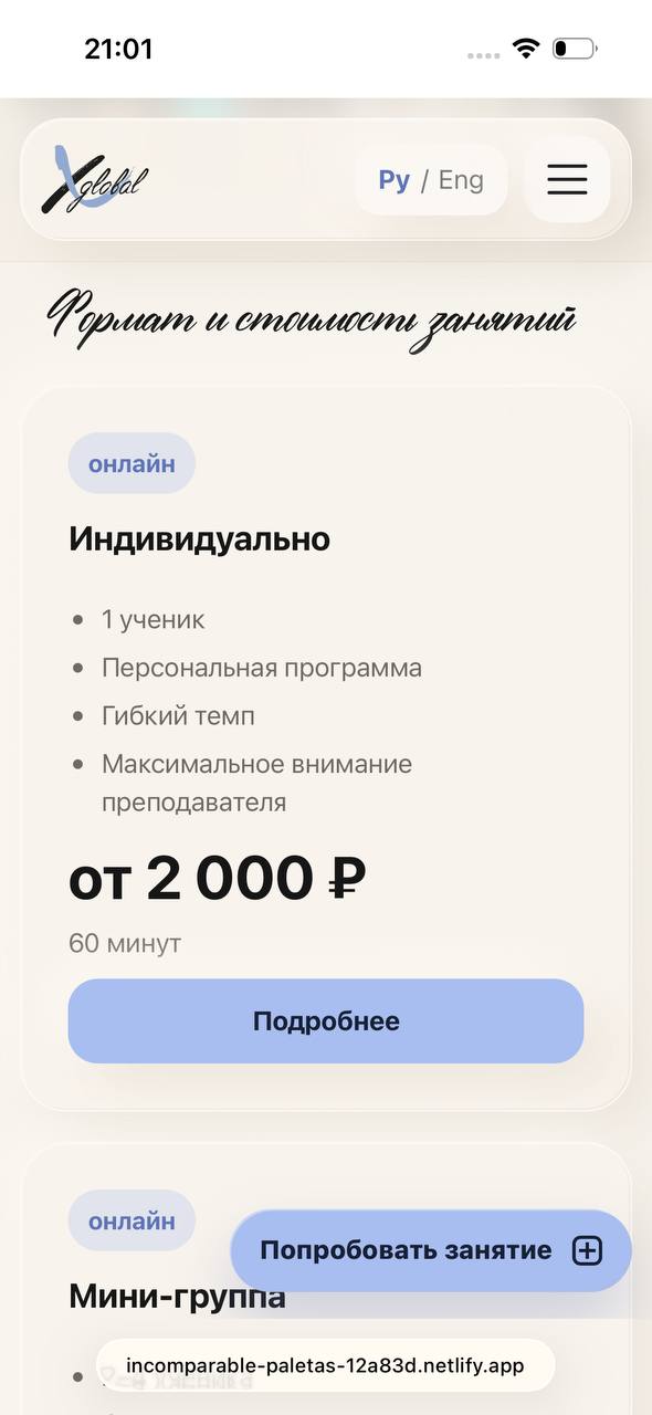
Teachers, trust and the school’s offer
1 / 7
Founders · experience and approachExpanded teacher profileStudent results and casesReal student reviewsA review in detailLearning formats and pricingContact information
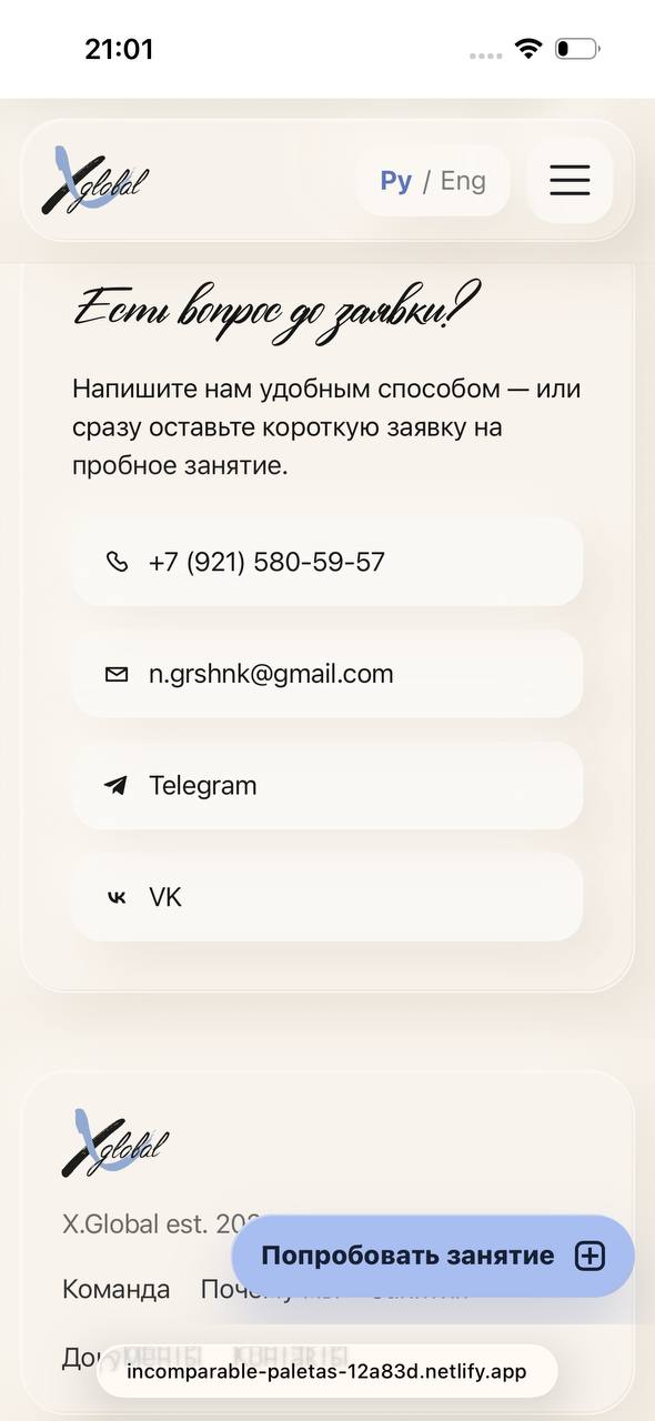
05. Implementation
A multi-page website built in HTML, CSS and JavaScript with AI-assisted development.
Website walkthrough · from the school to the trial-lesson form
06. Outcome
Designed and deployed a responsive X.Global website with a consistent visual language, a structured offer and a clear user journey.
The key result: moving from an informational website to an interface that supports decision-making and booking a trial lesson. SEO metadata, media optimisation and accessibility states are included.
The project is being iterated. Conversion results have not been measured yet. Analytics events are built in; planned metrics include Task Success Rate, Time on Task, Drop-off Rate and Conversion.
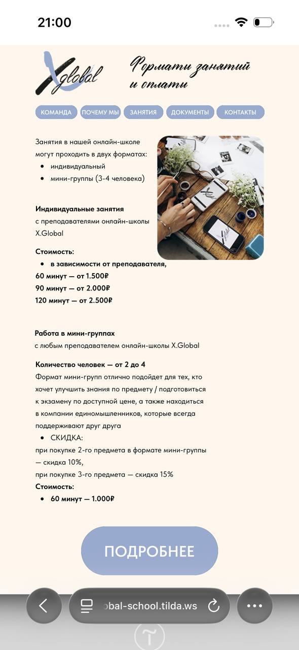
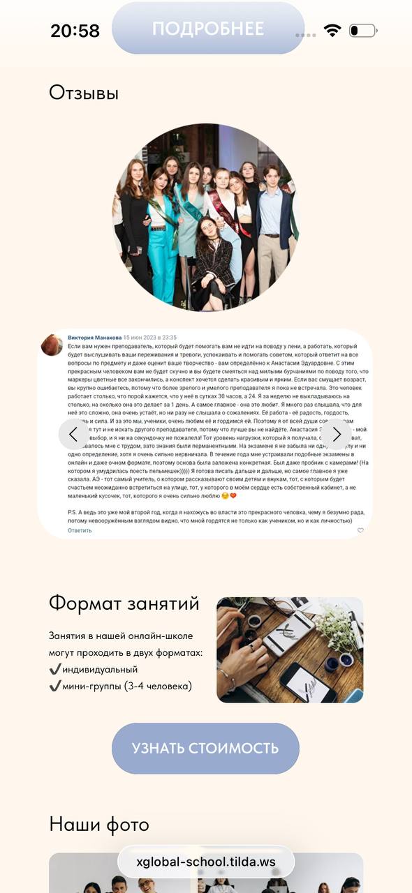
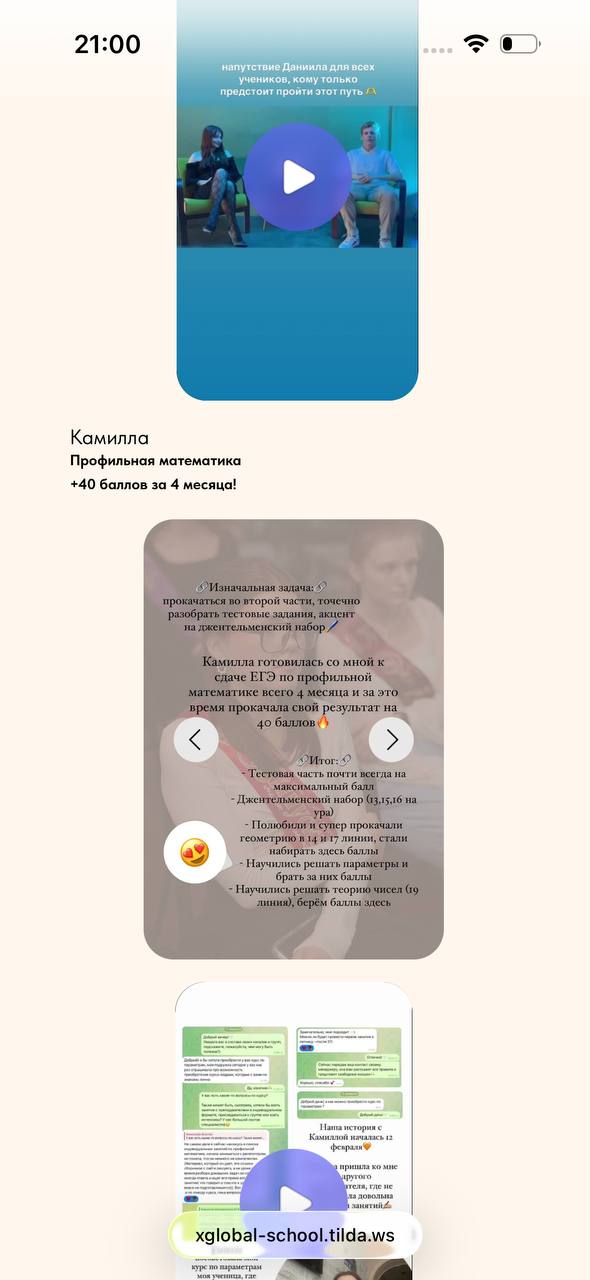
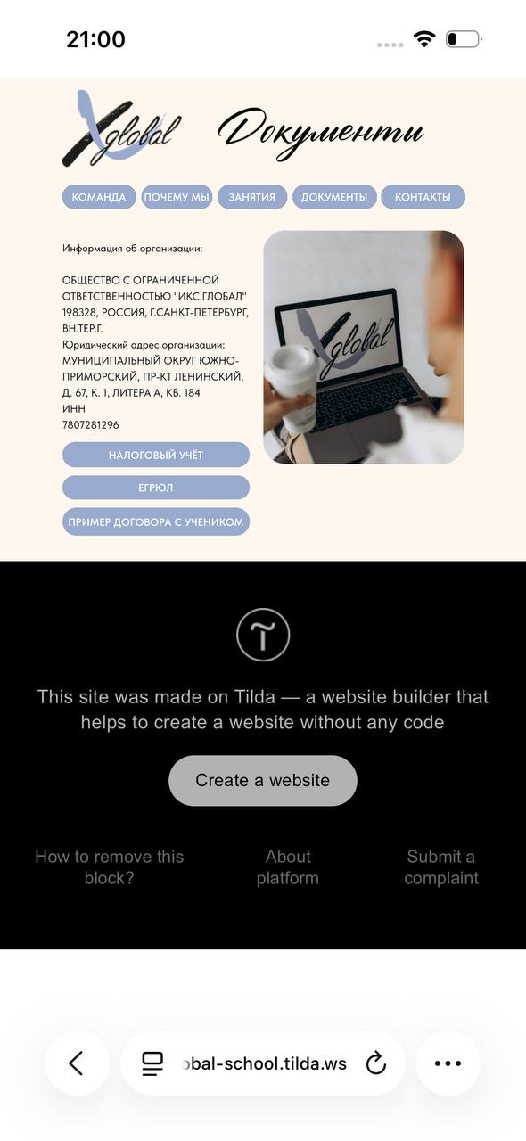
Archive · the previous website
1 / 9
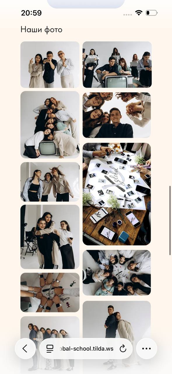
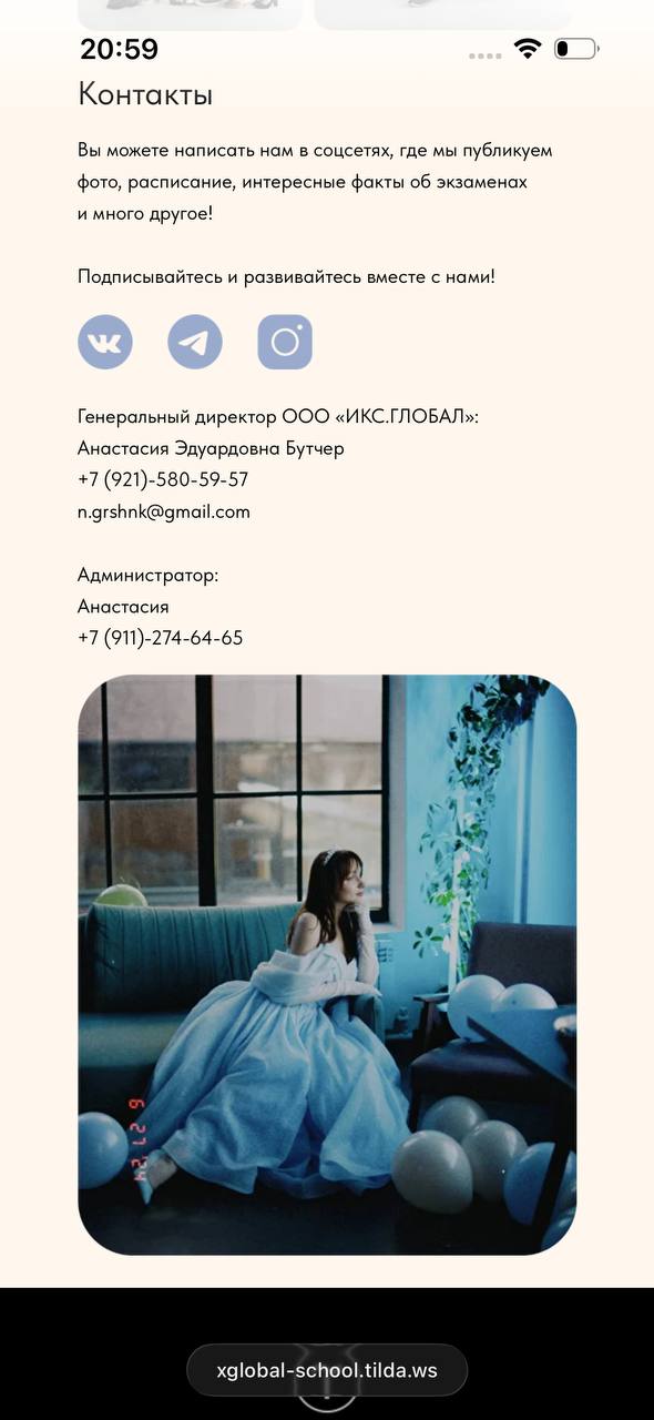
Before · advantagesBefore · teachersBefore · foundersBefore · pricingBefore · reviewsBefore · casesBefore · documentsBefore · school photosBefore · contacts
Case 02 · MVP in development
Polosa — music by independent artists
A service for discovering niche music, returning to artists, and directly purchasing music and merch.
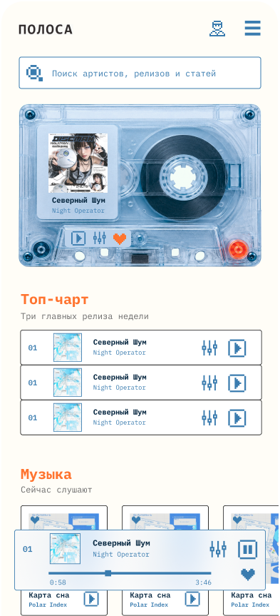
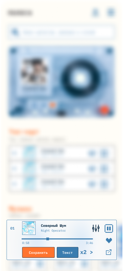
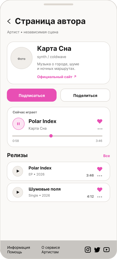
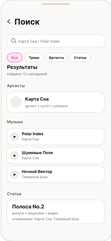
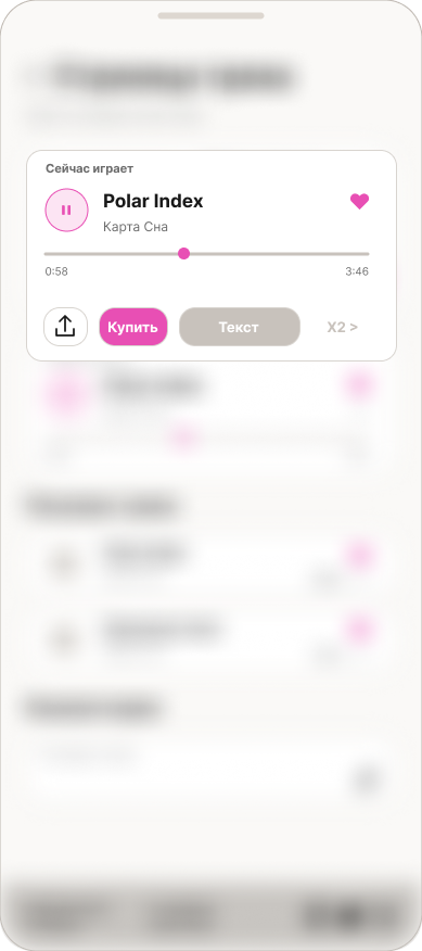
The player’s Play control is the first primary action: hear a track directly on the home page before deciding to explore the artist. Search supports visitors who already have a specific artist or release in mind.
The intended next steps are exploring the artist, saving a track and returning. This is the interface hypothesis; its impact has not been measured yet.
1 / 1
Playback on the home page
Problem context
01
Niche music struggles to compete for attention
On major streaming platforms, users often remain inside familiar algorithmic feeds, while discovering smaller artists takes extra effort.
02
Artist support is fragmented across platforms
Listening, artist information, music purchases, and merch often live in separate services.
03
Information overload keeps growing
In a constant stream of content, it becomes harder for users to notice new artists they might genuinely like.
04
Payment can be difficult for part of the audience
For Russian users, purchases on international platforms often require additional steps.
Listening, artist updates and purchases are often split between services. Polosa brings these steps into one experience.
Product goal
Shorten the journey from discovering an artist to saving them, returning, and choosing to support them.
Player and artist screens
1 / 3
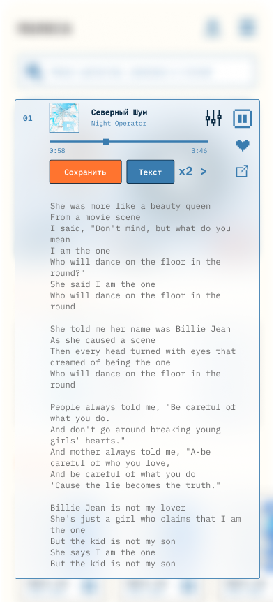
Playback settingsTrack lyrics in the playerArtist page · listen, follow and explore
Research
How people discover new music
A survey of active independent-music listeners in Saint Petersburg revealed recurring patterns in discovery, saving, and purchasing behavior.
Journey map insights
Three critical moments
Discovery
“Who is this, and should I keep listening?”
Music, brief context, and current events are brought together in one place.
Return
“How do I avoid losing track of this artist?”
Following and updates help the relationship continue after the first interaction.
Purchase
“Why is this worth my money?”
The price is supported by product details, uniqueness, and context from the artist.
Research findings & user flow
01
No exact query
Discovery often starts with recommendations and browsing rather than a search field.
02
Music comes first
An artist’s first screen should let users hear the music as quickly as possible.
03
Saving is the core action
“Save” and “Follow” are the key actions after first discovery.
04
Return loops need to be designed
After following an artist, the product should create reasons to return: a release, concert, or artist update.
05
Purchase comes later
The store should not compete with the first listening experience. Interest comes first.
06
People buy value
Users buy a desirable object and a closer connection to the artist, not only the idea of providing support.
1 / 1
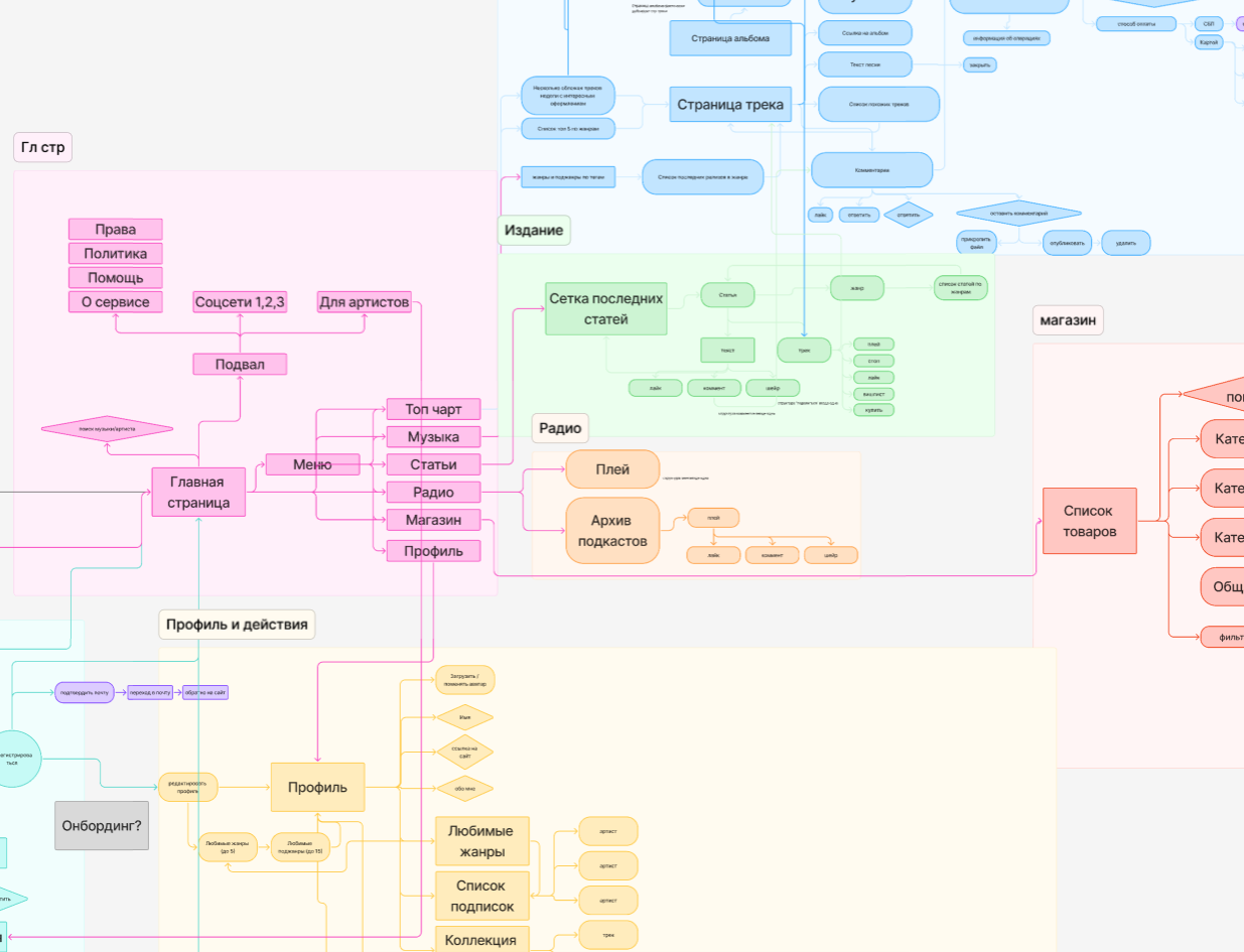
User flow excerpt: home, menu, editorial, radio, store, and profile scenarios are connected within one product structure.
User jobs
“I want to discover new music even when I don’t know exactly what I’m looking for.”
“If an artist interests me, I want to save them quickly and follow their updates.”
“If I connect with an artist, I want an easy way to support them and get something meaningful in return.”
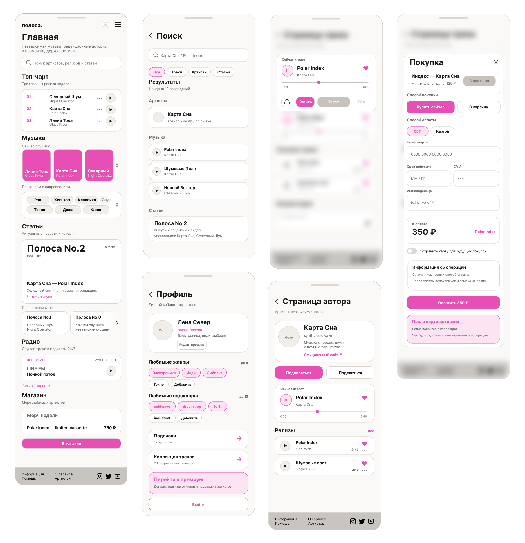
Wireframes & visual system
1 / 1
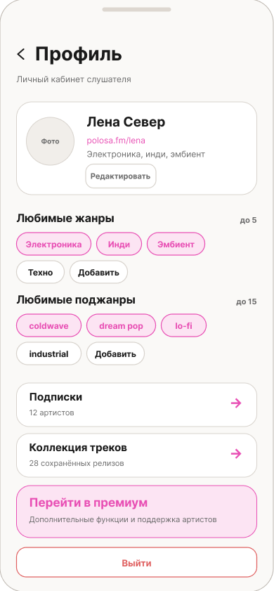
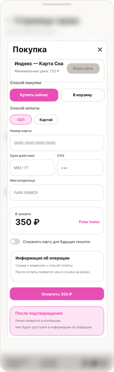
WireframesKey screens for validating the structure of discovery, profile, artist page, and purchase flows.
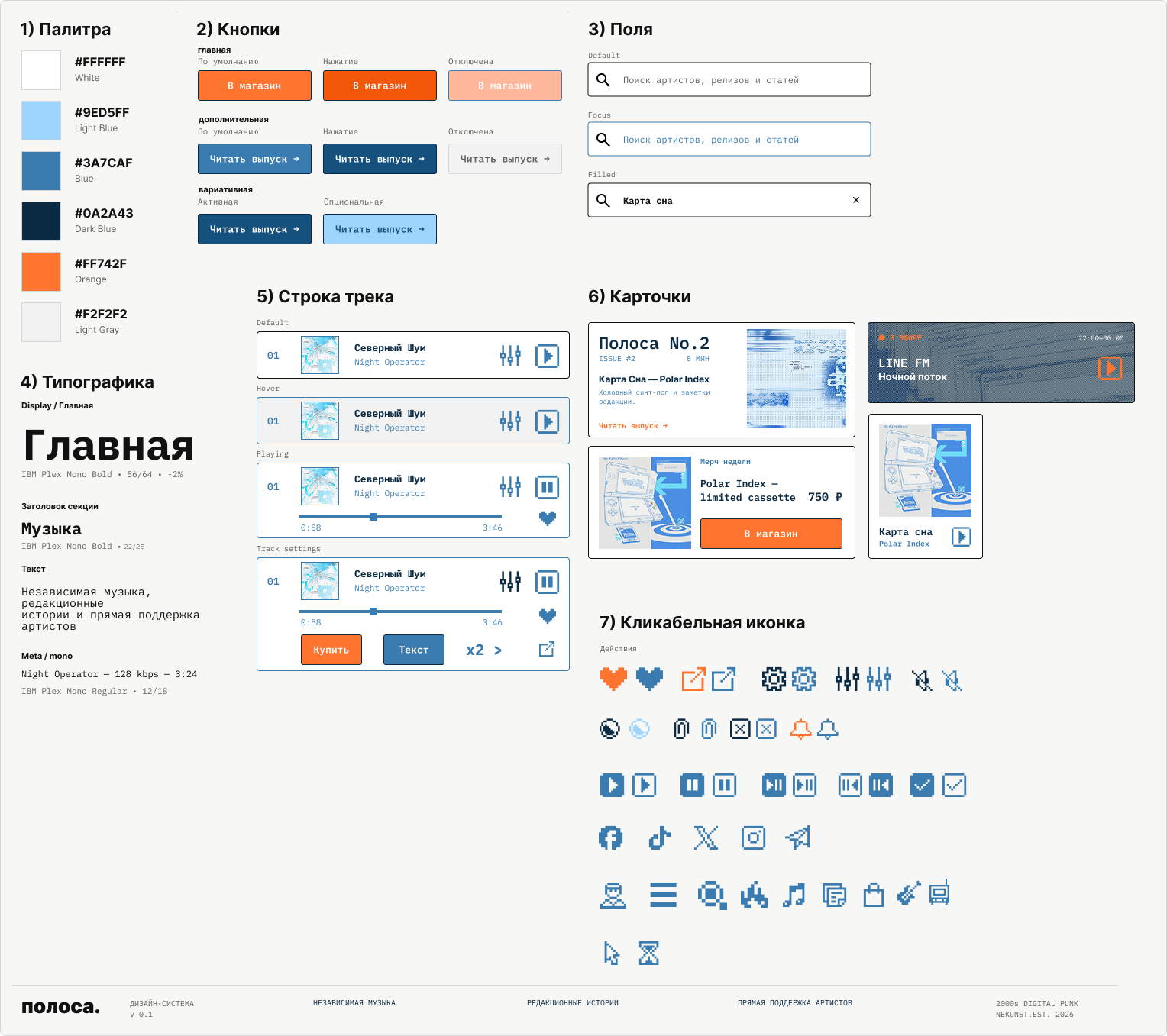
Visual system
Retro aesthetics as part of the positioning
Polosa is not only a service but also a media platform about niche artists. The visual system therefore draws from designer zines and early digital interfaces: simple, nostalgic, and less sterile than most contemporary music apps.
This approach helps the product stand out, supports its editorial character, and makes music discovery more memorable.
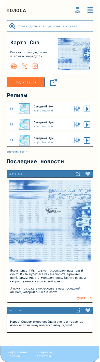
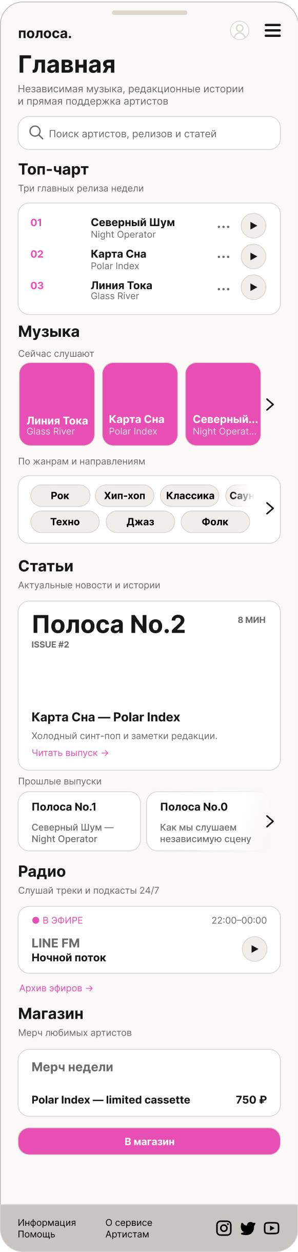
The home page as an entry point to both media and service
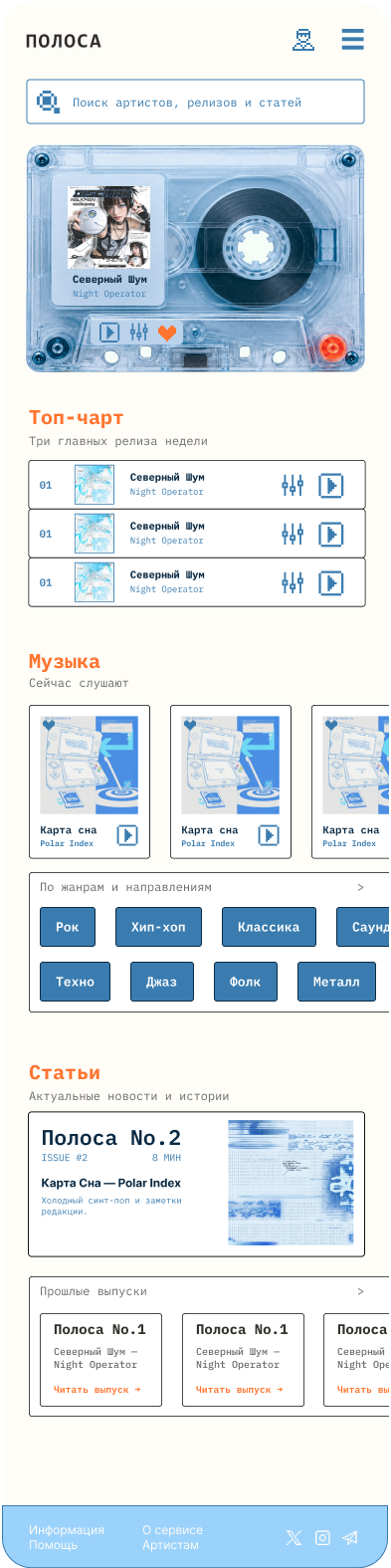
The long-form home prototype combines several scenarios: music discovery, quick access to the top chart, curated collections, editorial content, and the store.
the first screen centers on discovery and current music content;
editorial content and releases live in the same ecosystem;
the store appears as a next step after discovering an artist;
the long scroll presents the MVP as a connected media product rather than just a catalog.
1 / 1
Next step
Validate the MVP with the target audience
After connecting real data: usability testing, fixing critical issues, and validating the MVP against real user scenarios.
Planned metrics
Task Success Rate
Sign-up, search, and starting playback.
Conversion
Artist-page visits, follows, saves, and purchases.
Supported Access is a concept for an inclusive system that helps people use complex digital services independently while staying in control of their personal data and decisions.
It focuses on improving access to public, healthcare, financial and other socially important services.
The problem
Digital services often assume that users can navigate complex interfaces, legal language and multi-step processes on their own. When difficulties arise, people turn to relatives, sometimes sharing passwords, confidential information and full control of their actions.
The problem hypothesis draws on recent UK digital-inclusion research, particularly Informal and Proxy Support for Digital Inclusion (DSIT, 2026), which examines how people receive help with digital services.
The research highlights more than gaps in digital skills: complex interfaces, fear of mistakes, uncertainty about consequences and reliance on other people also create barriers.
An adaptive mode that makes complex processes easier through step-by-step guidance, plain explanations and reduced cognitive load.
SUPPORT MODE
A secure collaboration mode for inviting a trusted person to explain, check or help with a specific action without granting full account access.
Help without taking over.
Work completed
Preliminary research into four global social problems and 16 product concepts.
Reviewed existing solutions, international digital-accessibility practices and unmet user needs.
Defined the product concept, target audience and 10 research hypotheses.
Developed a UX research strategy: participant segments, in-depth interview structure and recruitment principles.
Preliminary assessment of technical feasibility, privacy, security and legal constraints.
Outlined a possible MVP architecture and effectiveness metrics.
Project goals
Social
Make essential digital services more accessible, reduce dependency on others and protect autonomy and privacy.
Product
Develop and test a scalable adaptive-interaction system that existing digital services could potentially integrate.
Professional
Create a research-led Product / Service Design case for international competitions, including iF DESIGN STUDENT AWARD and D&AD Future Impact.
Next step
Conduct in-depth interviews, test the hypotheses, map the customer journey and build an interactive MVP for usability testing.
Case 01 · self-initiated concept
SELA — navigation & home screen
A UX audit and redesign concept for the mobile app: fewer unnecessary steps, clearer interactive elements, and faster access to products.
ChallengeSimplify navigation and product discoveryRoleUX/UI designDeliverableConcept + prototype
Self-initiated portfolio concept. This is not an internal SELA project.
Before → after
Screen comparison
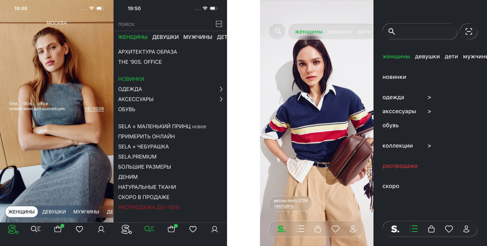
A comparison of the current app and the redesign concept: a new menu structure, more prominent search, and navigation patterns closer to familiar content-browsing behavior.
1 / 1
Earlier iteration · navigation comparison. Current motion screens appear below.
Problems
Three findings from the UX audit and the hypotheses that shaped the concept.
01
Unclear interactivity
Decorative and clickable banners look too similar, so it is not always clear which images lead to another screen.
Hypothesis
Use one consistent pattern: title, short description, and an explicit “View collection →” CTA.
02
Too many extra steps
To understand what some collections contain, users first have to open a separate screen.
Hypothesis
Preview products and looks in horizontal carousels directly on the home screen.
03
Overloaded menu
A large number of similar menu items makes scanning and finding the right category harder.
Hypothesis
Group nested categories and move collections into a more editorial home-screen structure.
Design decisions in detail
Solution
Navigation as a simple action matrix
01
Menu
Collection buttons are removed from the first level and moved into expandable lists. This reduces visual noise and makes the menu easier to scan.
02
Section structure
Core product categories — clothing, accessories, and footwear — are grouped visually, while “Coming soon” is moved lower as a planning scenario rather than an immediate purchase path.
03
Search
The search field is available directly on the home screen, shortening the path to a specific product.
04
Swipe patterns
Vertical and horizontal browsing follows patterns familiar from social products, reducing unnecessary taps.
05
Cards & banners
Product and look cards can be swiped within each section, quick-save is added, and banners get explicit CTAs so their interactivity is easier to recognize.
Explore the redesigned menu
Redesigned screens
The concept in detail
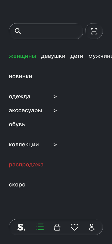
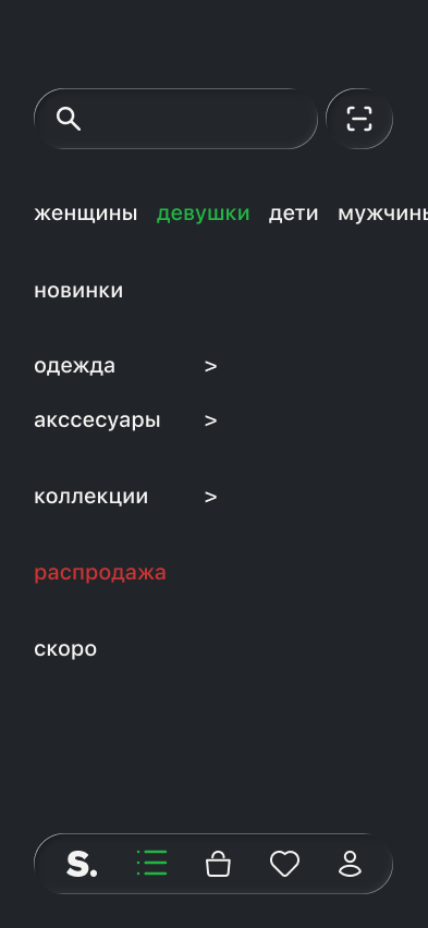
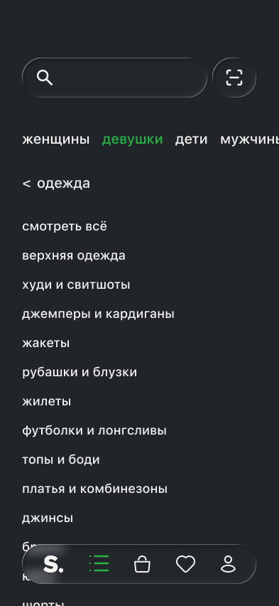
The menu screens show top-level categories and nested sections. Updated home screens follow below as motion previews.
1 / 3
Menu · womenMenu · girlsNested category
Motion hero · a living home screen
Animated hero screens bring movement to the women, men, kids and young sections. Motion introduces the collection while the catalogue and navigation remain available.
These are concept previews. Motion should support orientation without obscuring controls; its effect on attention and product discovery still needs testing.